Siete Foods
Systemizing heritage—bringing a family's warmth and maximalism to the web
Walk into any grocery store and you'll spot them: bright orange bags with layered patterns, vibrant colors that reference Mexican folk art, tortillas made from cassava and almond flour. Siete Foods started in a family kitchen—Veronica Garza making grain-free tortillas for her brother with autoimmune conditions—and grew into a heritage food brand found in stores nationwide. The packaging radiates personality. The social channels feel warm, generous, full of family stories. The website? It worked, but it didn't feel like Siete.
Years of growth had left the site with a patchwork foundation—a Shopify theme, a page builder layered on top, plugins for recipes and events, custom pages built in isolation. Every new content need got solved with another workaround. The team could make it function, but they couldn't make it sing. And for a brand built on warmth, heritage, and bringing people to the table, that gap mattered.
Siete knew something needed to change. They just weren't sure if that meant a new design, a new platform, or something deeper. Working alongside Drawn—the agency behind Siete's brand and packaging—we spent 13 months rebuilding their digital presence from the foundation up.
The brand challenge
Siete came to us through Drawn with a complex problem. The website wasn't broken—it was just fundamentally mismatched to the brand they'd become. But the challenge went deeper than visual refresh. Three things needed to happen:
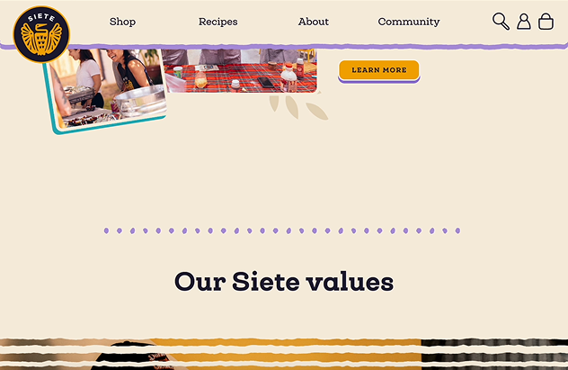
Siete's visual identity is layered, vibrant, heritage-driven—bold colors, intricate patterns, photography full of warmth and family. That richness works beautifully on packaging where everything is controlled. But on the web, where editors need to create new pages, launch products, and publish content regularly, that complexity had become chaos. Every new page was a bespoke build. There was no system underneath.
Recipes lived in a plugin. Events lived in another plugin. Products pulled from Shopify but couldn't connect to recipes or other content. If you wanted to update a product category description, you had to find every place it appeared and change it manually. The team was fighting their own website just to keep things updated.
Siete's goal wasn't just e-commerce—they wanted to drive people to retail stores where Siete products lived on shelves. They needed a site that built brand affinity, told their family story, and helped people find Siete at their local grocery—not just a transactional online shop.
Design foundation
Before touching any visuals or code, we needed to understand how Siete's brand—designed brilliantly for packaging by Drawn—could translate to a flexible digital system.
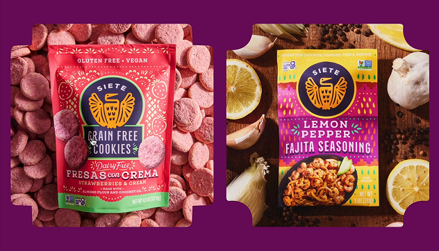
Drawn had created something distinctive: vibrant colors inspired by Mexican folk art, layered patterns that reference heritage textiles, warm photography centered on family and food. Our challenge was figuring out how that translated to screens—where could it flex, where did it need guardrails, and how could we keep the personality without losing coherence?
Siete's brand is rooted in Mexican-American heritage—the Garza family's story, traditional flavors reimagined for different dietary needs. But their audience extends across Latino cultures and beyond. The brand needed to honor that specificity while remaining inclusive. How do you celebrate heritage authentically without making anyone feel like they're not invited to the table?
We mapped what existed and what needed to exist. Recipes, events, products, stories—these weren't just "pages," they were content types with relationships between them. A recipe features products. An event connects to recipes. Products appear across multiple contexts. The site needed an information architecture that could hold these relationships, not just a collection of isolated pages.
Siete's marketing team needed to move fast—launch products, publish recipes, promote events—without depending on developers for every update. The system had to be flexible enough to support their creativity but structured enough to maintain brand consistency.
This understanding gave us our design direction:
build a system that can hold Siete's maximalist energy while giving the team control.
Brand Identity (digital translation)
We worked with Siete's team and Drawn to translate the brand's visual richness into a coherent digital system.

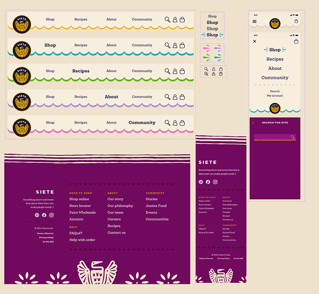
Primary brand colors stay global—the orange, the vibrant accent colors everyone associates with Siete. But we added a secondary system: accent colors that vary by page grouping (products, recipes, community). CTAs are color-coded by context. Even shadows tie back to page group colors. This lets the brand breathe and shift while maintaining visual continuity.
Siete's patterns are layered and intricate—beautiful on packaging, but potentially overwhelming if applied without structure to digital layouts. We identified where patterns could live (headers, section breaks, accents) and created clear rules for how they combine. The maximalism stays, but it's intentional, not accidental.
The brand's typography references Mexican vernacular design—warm, approachable, confident. We brought that same personality to the web while ensuring readability across different screen sizes and contexts.
Siete's photography shows real families, real kitchens, real moments around food. We made sure the site could showcase that warmth—not just as hero images, but woven throughout the experience.
Digital Presence
We rebuilt Siete's website on a new foundation that separated content management from commerce, giving the team control while maintaining brand coherence.
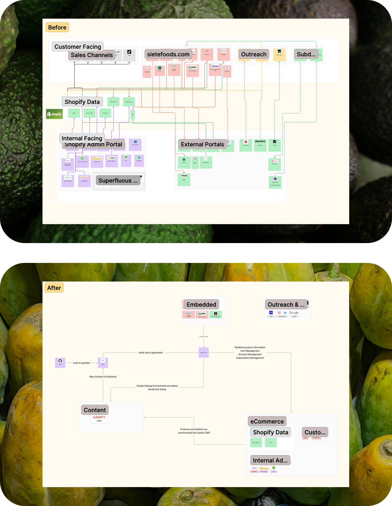
We moved from a monolithic Shopify theme to a system where Shopify handles commerce, Sanity CMS manages content, and integrations connect to tools like Swoogo for events. This wasn't about chasing new technology—it was about giving editors the right tool for each job.
Recipes are now first-class content objects with proper structure—ingredients, dietary tags, featured products, cooking instructions—all connected and manageable. Same with events, which integrate with Swoogo and update automatically. Products flow from Shopify into Sanity and render with consistent brand-aligned layouts.
We created a flexible page builder using reusable, brand-aligned sections. Editors can assemble pages, create seasonal campaigns, and launch new content—but within a system that keeps everything coherent. No more bespoke one-offs that drift from the brand.
Since Siete's strategy prioritizes retail distribution, we made finding Siete products in stores just as easy as buying online. The store locator is prominent, the content builds brand affinity, and the experience supports the business model—not just pushing every visitor toward checkout.
The site loads quickly, updates smoothly, and works reliably—because when people are looking for products at dinner time or searching for a recipe before grocery shopping, speed matters.
Brand Systems
We built systems that let Siete's team operate independently while maintaining brand consistency.
Every content type (recipe, event, product, story) has a clear structure that ensures completeness and enables relationships. Add a recipe, tag the products it uses, and those connections work everywhere.
Section templates, content blocks, layout patterns—all built with Siete's visual language baked in. Editors can create new pages knowing they'll feel brand-aligned without starting from scratch every time.
Products connect to recipes. Recipes reference events. Everything links naturally because the system understands these relationships—not because someone manually created each connection.
The team knows how to structure a recipe, how to write product descriptions, how to build a landing page. The system guides good decisions while staying flexible.
How we honored the brand
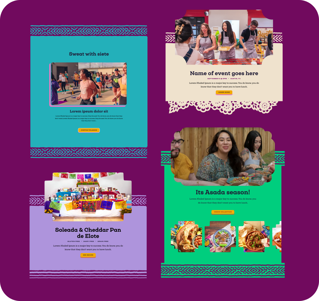
Siete's brand is layered, maximalist, full of personality. We didn't simplify that for digital—we built a system that could hold all of it. Color variations, pattern layers, rich photography—it's all there, just organized so it works together.
Every decision prioritized Siete's marketing team who'd live with this system daily. Can they launch a product? Publish a recipe? Create a seasonal campaign? If they needed a developer for basic updates, the system failed.
Recipes aren't just pages with ingredients—they're structured objects with dietary tags, product connections, and cooking steps. Events aren't blog posts—they integrate with event management tools and update automatically. We gave each content type the structure it needed.
We worked to ensure the visual richness, the photography, the language—all of it felt true to Siete's Mexican-American roots while remaining welcoming. The brand celebrates where it comes from without creating boundaries around who it's for.
Results (and what's next)
Siete Foods launched their rebuilt digital presence with a system that finally matches the quality and personality of their packaging, photography, and social channels. The site feels cohesive, vibrant, distinctly Siete—and the team can run it themselves.
The site is significantly faster—moving from scores around 40 to consistently in the high 90s. Pages load quickly, navigation feels smooth, and the experience works reliably across devices.
The marketing team went from juggling multiple plugins and disconnected systems to one unified platform where content lives in one place and appears everywhere it should. They adapted quickly and, by their own account, love working in the new system.
The digital experience now matches the rest of the brand. Whether you see Siete on a shelf, on Instagram, or on their website, it feels like one unified brand with consistent warmth and personality.
The site supports Siete's business priorities—driving customers to retail stores, building brand affinity beyond transactions, and making it easy to find Siete products wherever people shop. As Siete continues growing, the foundation is there: a system that can scale, content that's manageable, and a brand that feels authentic everywhere it shows up.
A patchwork site fighting its own brand → a flexible system that honors Siete's maximalism while giving the team control.
Building something rooted in heritage that needs to scale?