
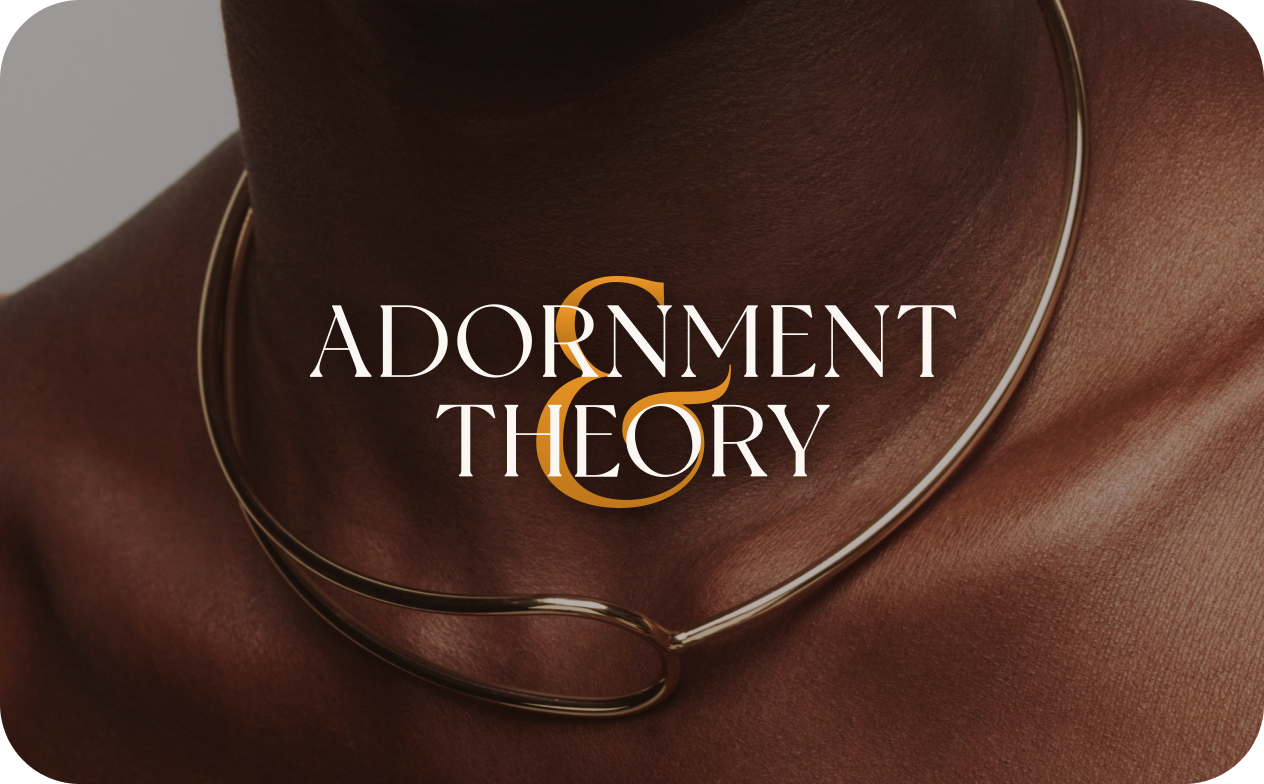
Adornment & Theory
Building a brand as intentional as the mission—equity, craft, and a jewel box in Chicago.
Walk into Adornment & Theory and you'll see gold glinting under warm light, intricate patterns echoing Moroccan tilework, jewelry from fifty-plus designers representing stories from across the globe. This isn't just a boutique—it's a platform. A space Viviana Langhoff built to represent her own work as a fine jeweler and to uplift Black, brown, indigenous, and women-identifying designers who rarely get shelf space in traditional jewelry stores.
Since opening in 2017, the store has become what Viviana calls "the jewel box"—Chicago's award-winning independent jewelry destination. But as the business grew, so did the complexity. Fifty designers. Custom commissions. Equity and restorative justice work happening behind the scenes. Community events. A growing online presence. The brand needed to evolve to carry all of it—not just the beautiful surfaces, but the mission underneath.
Viviana's vision was clear: a brand that could hold her maximalist aesthetic while honoring the diverse voices she represents. We helped her build it.

The brand challenge
Viviana came to us ready for the next chapter. Adornment & Theory had found its voice and its community, but the visual identity needed to grow alongside the business. The challenge wasn't that the brand was broken—it was that the work had outgrown its container. Three things needed to shift:

Representing 50+ emerging designers—each with distinct aesthetics, cultural references, and stories—requires a brand flexible enough to showcase that diversity without losing cohesion. The identity needed to be a stage, not a single spotlight.
Viviana's aesthetic draws from Moroccan metalwork, Art Deco geometry, and her own design sensibility. But more importantly, every piece in the store is there because of its story, its craft, and the designer behind it. The brand needed to reflect that curatorial rigor—abundant and layered, but never accidental.
Adornment & Theory doesn't have a full-time brand manager or marketing department. Viviana and her team are sourcing jewelry, designing custom pieces, hosting community events, and doing equity work. The brand system needed to be flexible and usable—something the team could apply to packaging, signage, seasonal campaigns, and social without reinventing the wheel every time.
Design foundation
Before we touched any visuals, we needed to understand what the brand needed to communicate and what couldn't be compromised. Through conversations with Viviana, we clarified what Adornment & Theory stands for—not just from other jewelry stores, but within the entire industry:
A curator and platform for underrepresented voices in jewelry design. Viviana isn't just selling beautiful pieces—she's actively working to close gaps in representation and wage equity in an industry that has historically centered white, male designers. She's a fine jeweler herself, but she's also building a table where other makers can sit.
People who want jewelry that carries meaning. Not "statement pieces" for the sake of attention, but pieces with stories, provenance, and integrity. Customers who understand that when you buy from Adornment & Theory, you're not just getting a ring—you're supporting emerging designers who might not otherwise have access to retail space or fair compensation.
The visual identity had to feel maximalist—but elegant, never chaotic. It needed to hold complexity and abundance while maintaining sophistication. Every element had to support the curation, not compete with the jewelry itself.
This understanding gave us our design direction:
the brand should feel generous and layered, curated but not exclusive, rooted in equity and craft above all else.
Brand Identity
We built a visual system that could hold Viviana's maximalism with structure.

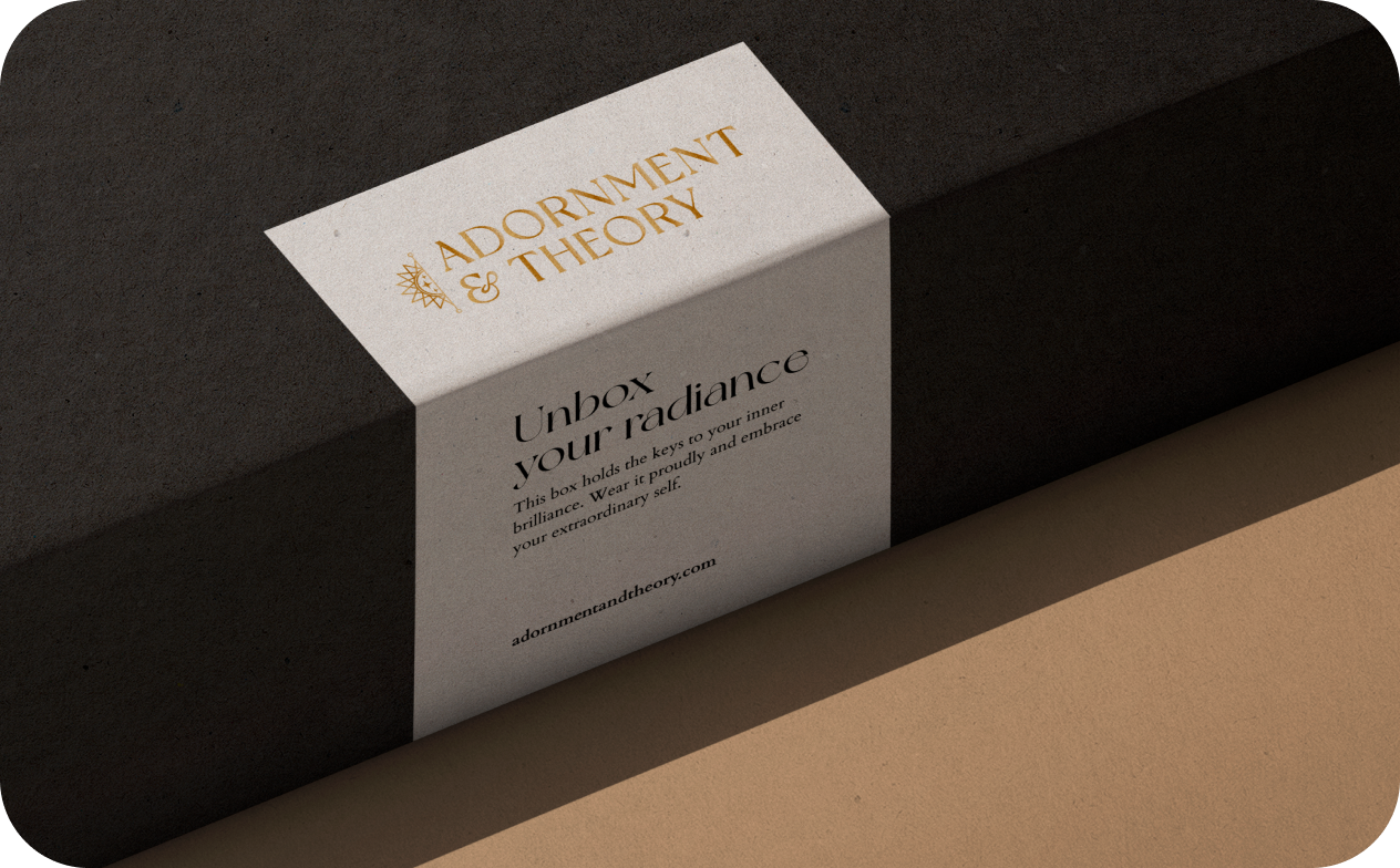
A geometric mandala that references Moroccan zellige tile patterns and Art Deco symmetry. It's intricate without being fussy—you can see the craft in it, but it doesn't compete with the jewelry itself. The logo works large (on signage) and small (stamped on packaging), and holds up in single-color applications when needed.
We created a modular pattern system drawn from Moroccan tile, Chicago ironwork, and jewelry-making tools. These patterns can be mixed, layered, or used alone—giving the brand visual flexibility without losing coherence. One pattern for gift wrap, another for business cards, a third for seasonal campaigns. They all feel related, but nothing repeats.
We leaned into richness. Opulent gold, deep green, chartreuse, warm terracotta, and off-black. Colors that feel like metal and stone, that photograph beautifully with jewelry, and that signal craftsmanship over trend.
A refined serif for headlines (elegant but not delicate), paired with a clean sans for body copy (legible, modern, not trying too hard). The balance keeps things grounded—serious about craft without feeling stuffy.
How we built for abundance
We didn't impose a maximalist aesthetic—Viviana already had one. We just gave it structure. Our job was to honor what made her taste distinct, then build a brand system flexible enough to hold all of it.
Maximalism without structure becomes chaos. We built a tight underlying grid and a limited color palette—so when Viviana layers patterns or mixes metals in her displays, it feels curated, not cluttered.
Viviana and her team are running a boutique with all that entails—they're not managing a separate branding department. We made sure every deliverable was something they could actually use: templates they could adapt, patterns they could mix, guidelines written in plain English. The brand had to work for them, not the other way around.
Results (and what's next)
Adornment & Theory now has a complete visual identity system—logo, pattern library, color palette, typography, and brand guidelines with packaging templates—that supports the full scope of the business. Viviana and her team can package a custom engagement ring, prepare materials for a trunk show featuring a new designer, or create social content for a seasonal campaign, all while maintaining brand cohesion.
The visual identity now reflects the scale and intention of the work happening inside the jewel box. When customers encounter the brand—whether in-store, online, or through packaging—they see a business that takes representation seriously, honors craft, and brings a distinct curatorial voice to everything it touches.
Since the rebrand, Adornment & Theory has been recognized as the #1 jewelry store in Chicago and continues to expand its platform for emerging designers.
A growing business with an evolving mission → a brand system that could hold all of it—the maximalism, the diverse voices, the equity work, and the craft.
Want a brand that can hold your whole vision—not just the tidy parts?


